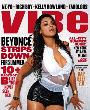
Vibe magazine is a American based magazine which specialises in hip-hop & R&B music. I can tell this because of the artists featured within the magazine for example Beyonce is a R&B and Hip-Hop artist they also advertise the names of other Hip-Hop/R&B artists such as Ne-yo, Rich Boy, Kelly Rowland And Fabulous. From the front cover i can gather that the magazine is mainly aimed towards men this due to the way in which Beyonce is used on the front cover for example the fact that she is project in a wet look effect and exposed clothing is more appealing towards men rather than women promoting this is a man's magazine. Another way in which i can tell the magazine is aimed towards men is thought the use of the main header which says 'Beyonce Strips down for summer' This shows the magazine is aimed towards men again as the magazine is referring to women stripping down i also think that the age of the target audience is about 16 -25 through the image of beyonce and also through the other artists names which are mentioned at the top of the magazine which are more likely to be known be by this age group
Another way in which the magazine can be said to be aiming at an older more mature audience for example teenagers of 16+ is through the selling lines which make the audience want to buy the magazine for example the selling line on this magazine is 'see 10 pages of beyonce as you have never seen her before' this along with the image projects a more older
mature audience being targeted.
The use of the colour red and black is used to make the magazine stand out and to catch the readers eye the use of the colour red can be used to combine with the image are used to catch the audiences eye while beyonce herself is on a white background which can be used to project a sense of innocence although her clothing suggest otherwise this image projects women who do r&b/ hip-hop to be provocative as well as very successful as we can see from the gold jewellery which is on her two wrists which show she is successful. Another way in which the magazine trys to catch the readers attention is through the typography. As the Vibe magazine has used bold typing in order to draw more attention to the magazine for example on the masthead combined with the red and black writing this makes it more likely to draw attention from the readers more than other magazines because it stands out the most.